The Interactive News
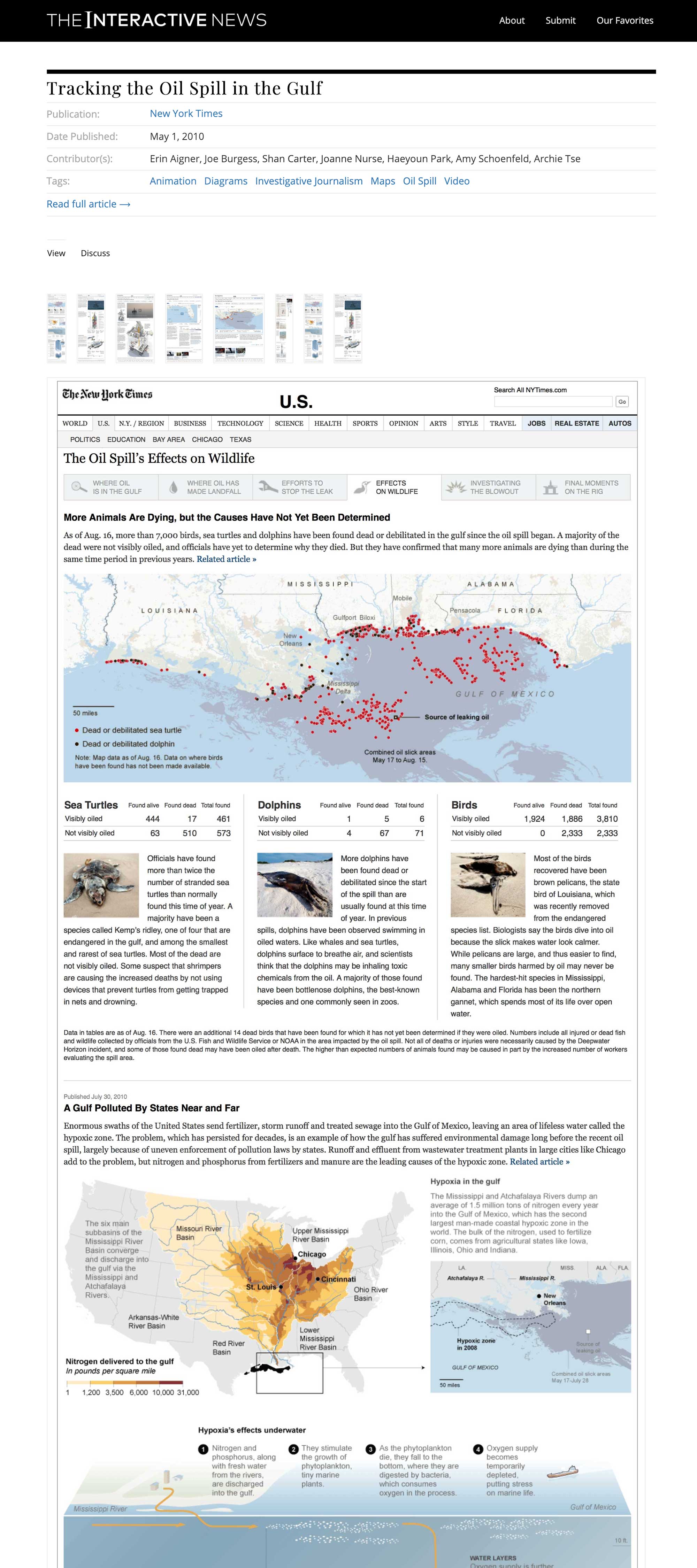
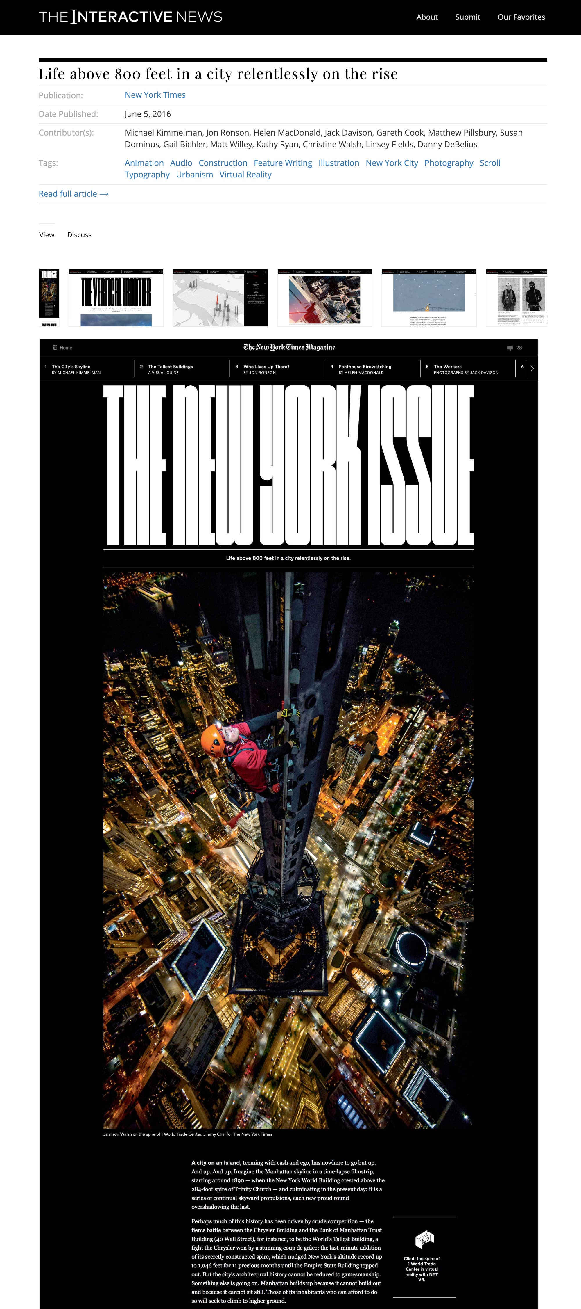
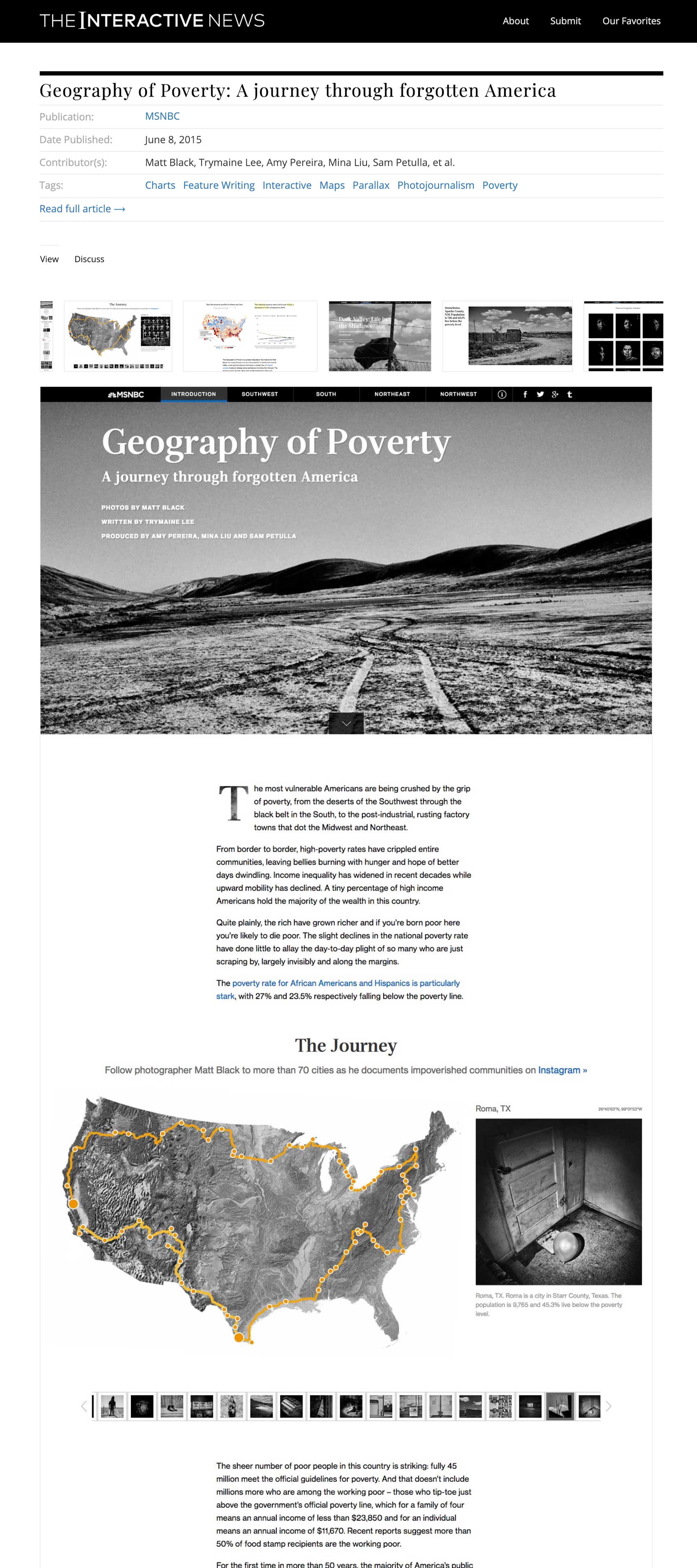
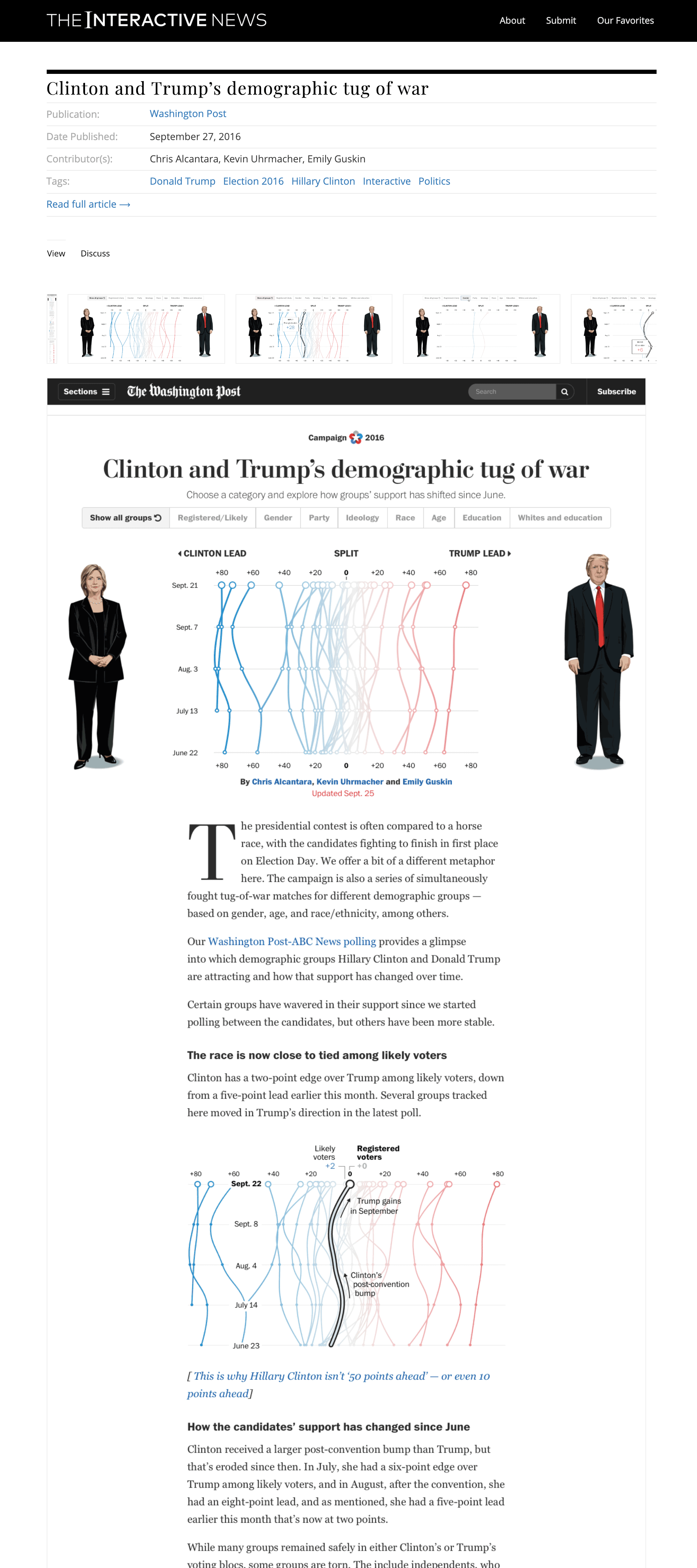
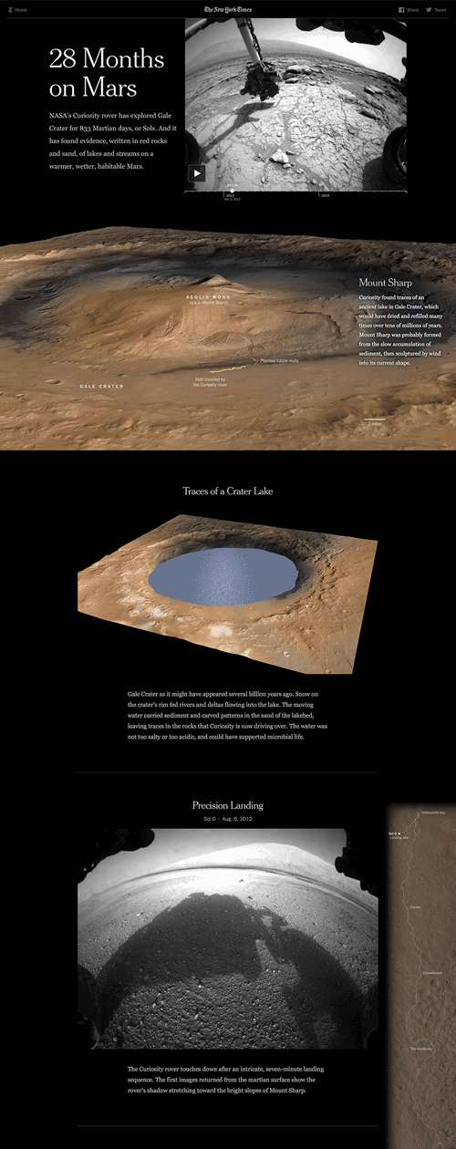
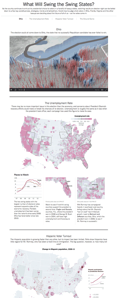
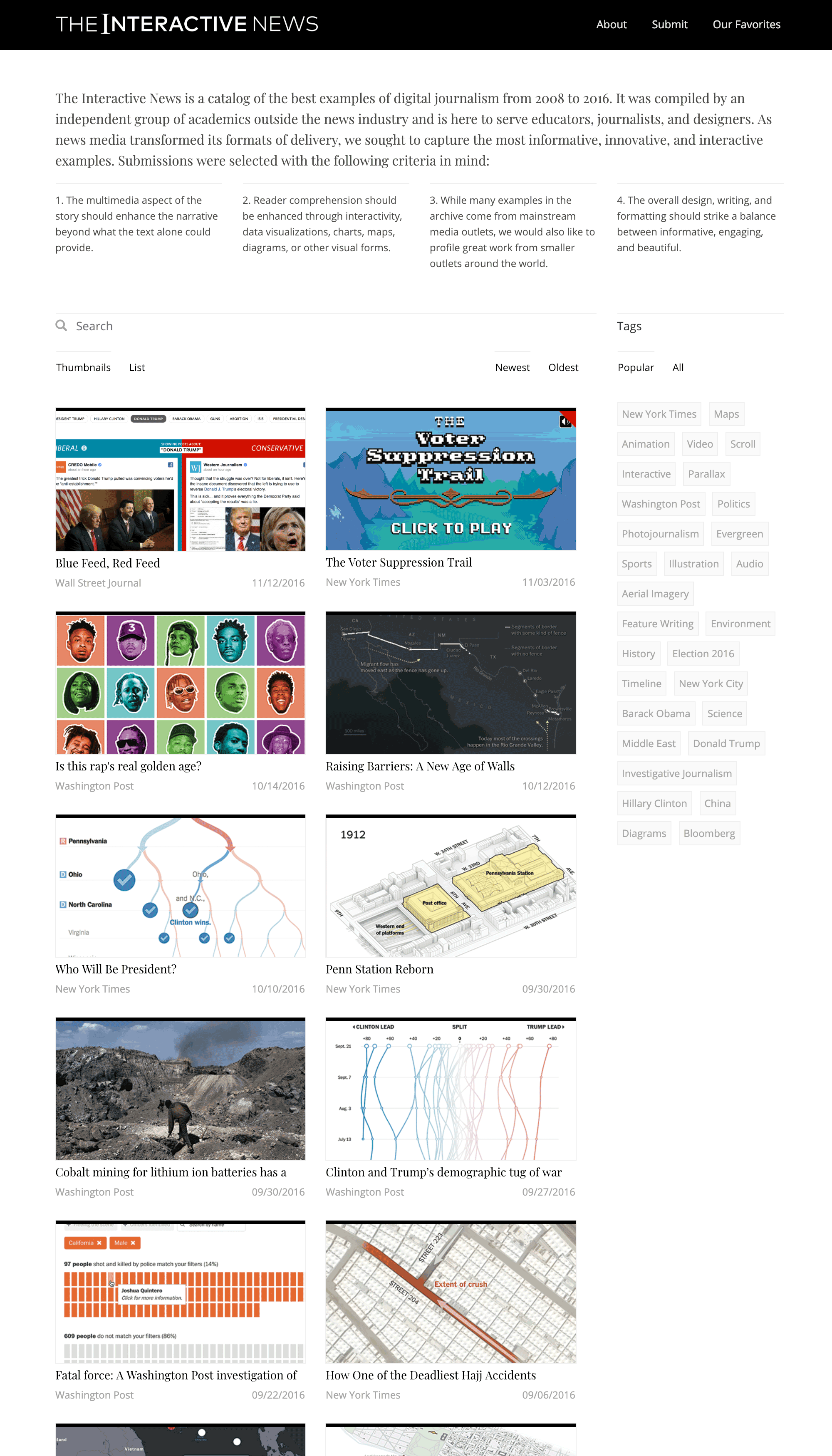
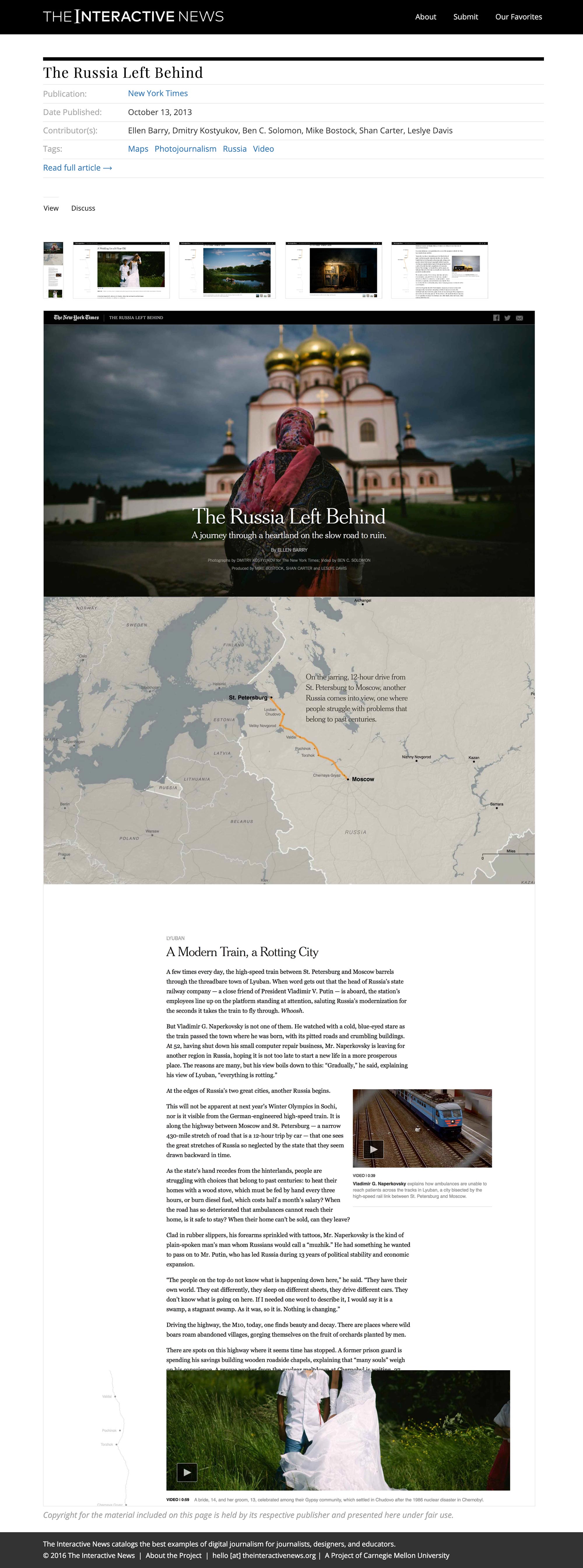
The Interactive News was a catalog of the best examples of digital journalism from 2008 to 2016. I designed and launched the site to archive these exceptional digital moments and to serve educators, journalists, and designers. As news media transformed its formats of delivery, I sought to capture the most informative, innovative, and interactive examples.
Roles: Site creator, grant writer, designer, and curator.
Grants: Carnegie Mellon and Qatar Foundation. The Interactive News was a project of Carnegie Mellon University.
Collaborator: Ahmed Hashmi, UX designer and developer.
Advisors: Dan Boyarski (Carnegie Mellon), Andrew Mills (Northwestern), Kelly Murdoch-Kitt (University of Michigan), Susan Hagan (Carnegie Mellon)


“All the boundaries of print just feel so incredibly old-fashioned now — the need to do things in a certain shape, in a certain mix, by a certain time of day in the week.”
Tina Brown, 2012
Perhaps it goes without saying that the way news reporting is presented and the ways in which readers consume it has changed drastically in recent years. As newsrooms went digital, their initial efforts mirrored traditional print formats. But something began changing around 2008. I noticed it on Election Day when the New York Times ran an interactive feature called Word Train. It was interactive, engaging, simple, and smart. It was different.
I subsequently included it in my graduate thesis at Carnegie Mellon, arguing that the word train represented a shift in the product of media companies, moving from a focus on disseminating information to being a place of collaborative contribution. In the design world, it represented a shift from static communication to interactive experience. Interactive pieces can not only present new forms of engagement but heighten comprehension and bring about a different level of intimacy with the content. At the same time as the word train, the shape of online front pages began to change, pushing video, interactive maps, charts, and diagrams to the top-of-the-fold.
“We are entering a golden age of journalism,” said the late David Carr while speaking with Terri Gross in 2011. He was talking about how his capabilities as a journalist have been heightened through new technology, but the same could be said for how journalists communicate to their audience. Part of this golden age is marked by experimentation in how stories are designed and delivered. Designers, media professionals, and readers light up twitter when a news outlet publishes something innovative, or produces a long-form piece that simply could never have been so nice in print.
The criteria I used in selecting articles for the archive included:
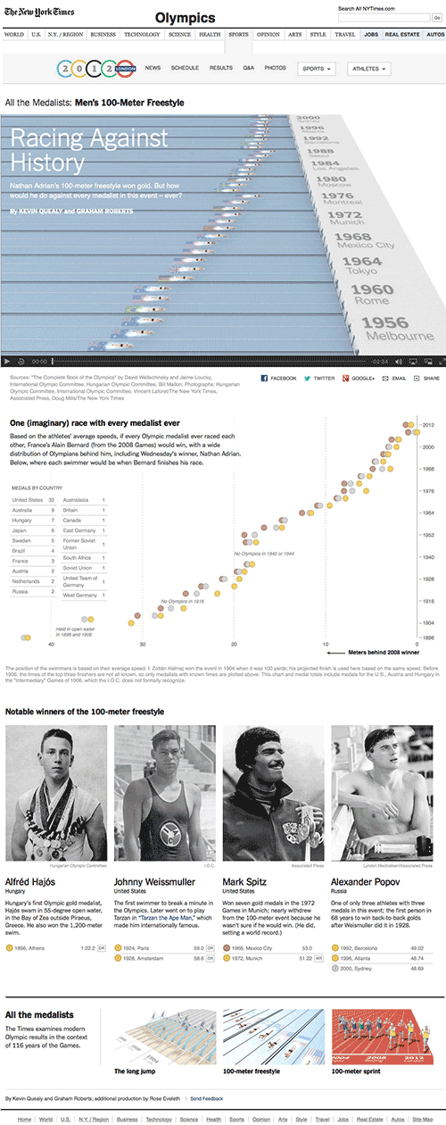
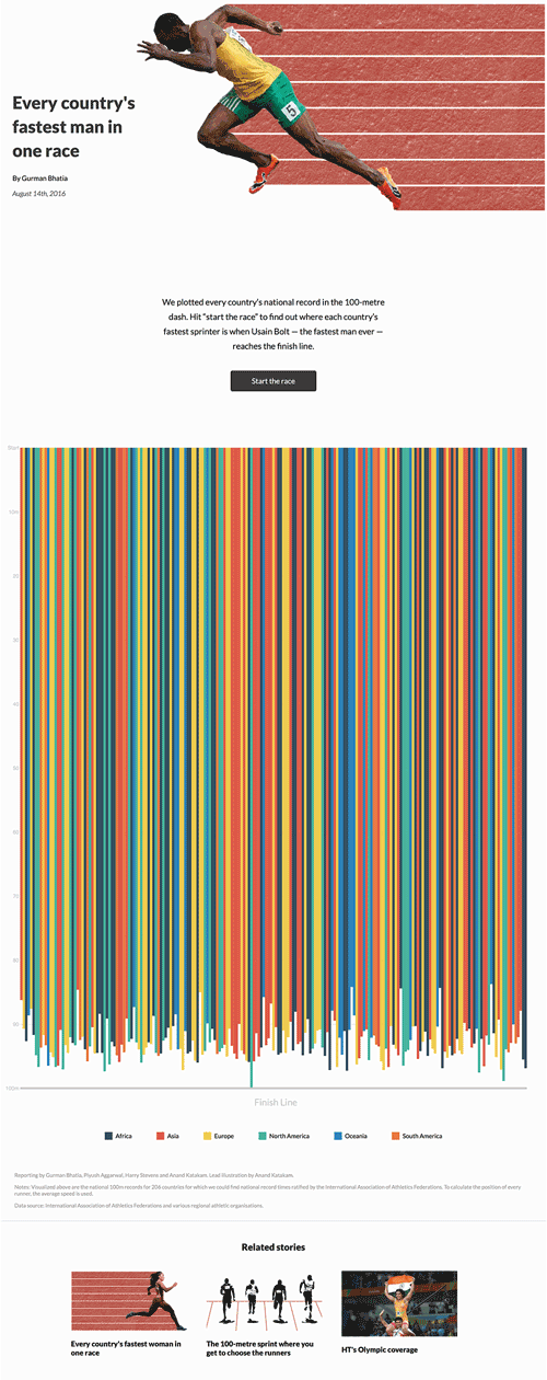
- The multimedia aspect of the story should enhance the narrative beyond what the text alone could provide.
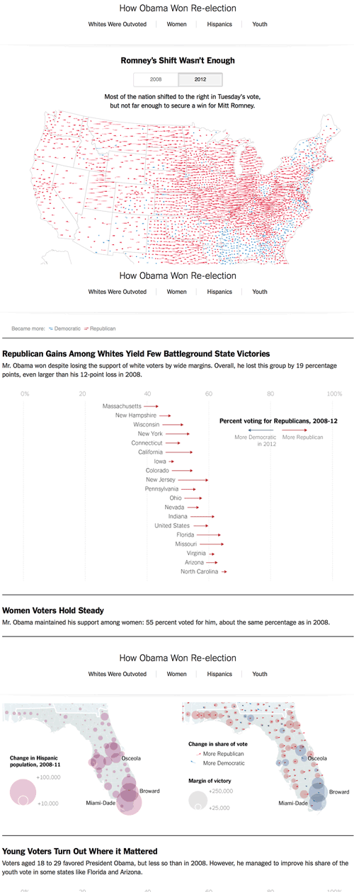
- Reader comprehension should be enhanced through interactivity, data visualizations, charts, maps, diagrams, or other visual forms.
- While many examples in the archive come from mainstream media outlets, we would also like to profile great work from smaller outlets and from around the world.
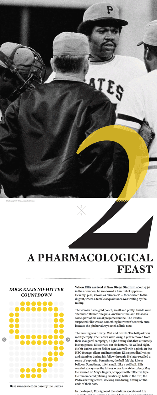
- The overall design, writing, and formatting should strike a balance between informative, engaging, and beautiful.
